I have been using TinkerCAD lately, to tinker (pun intended!) with Arduino board circuits. TinkerCAD a is free, web-based tool that lets you create 3D objects and quite complex electronic circuits. I love the interface and thought this might be a good test case for a true software simulation (not a pre-recorded step-by-step demo) with Storyline 360.
I had done a software simulation in Storyline 2 and the same concepts still apply. Most of the UI functionality is implemented on layers on the masterslide.
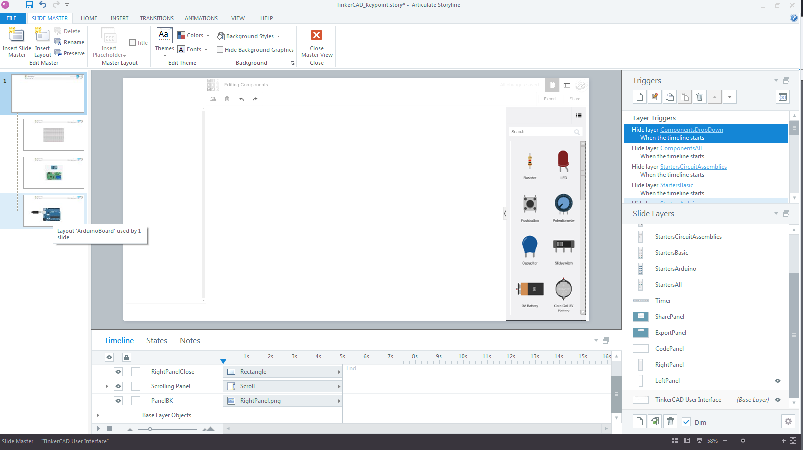
All the dropdown lists, buttons to start/stop the simulation, etc. reside on layers in the master. I also created separate layouts. For example, there is one layout for any exercises that use Arduino boards. The key was to have the layers display on top of each other.
The functionality for a specific board layout is contained on the actual slide. In my example, I used a simple board layout with three LEDs. By separating the UI functionality from the functions of a specific board layout, I can reuse the overall UI elements for as many different slides as I want.
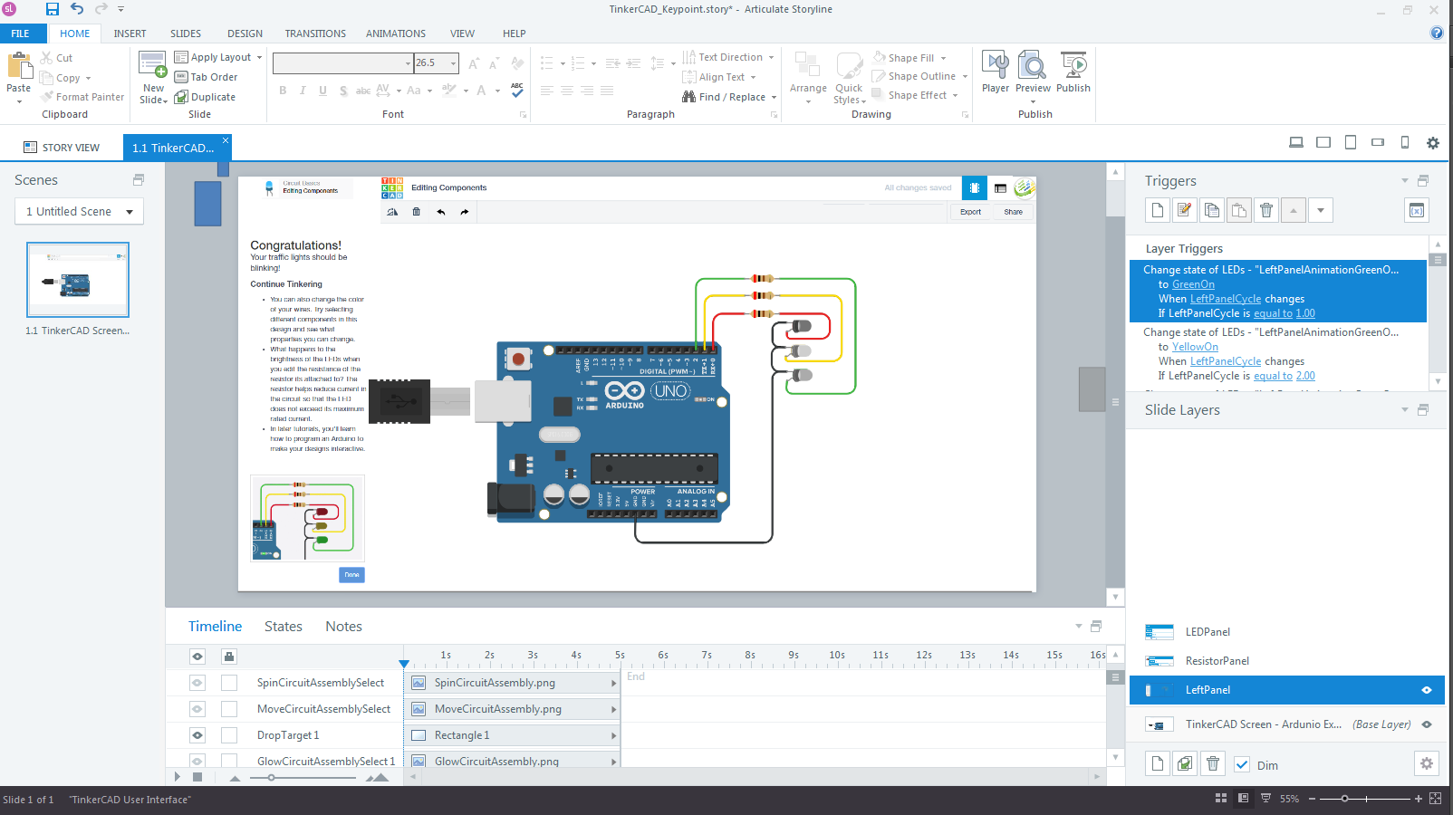
The video below shows the functions enabled in the sim and also compares the real TinkerCAD interface vs. my simulation.
And here is a link to the published Storyline simulation. I also tested this on a mobile device and it worked reasonably well.
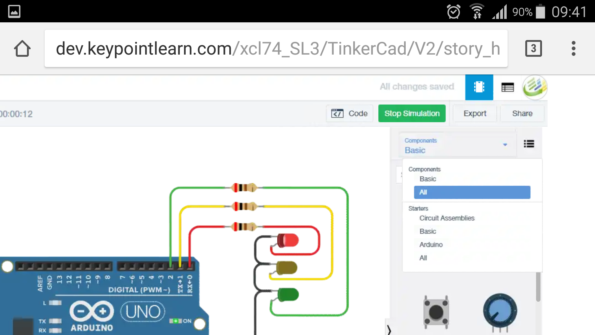
Creating simulations like this example takes more work than simply recording a screen sequence. However, it does add more realism and lets learner explore more freely, rather than having to follow a predetermined sequence of steps. It could also be used in ‘TryIt’-style interaction or in a scored quiz.
Note: As always with my experiments, I stopped at “good enough” and didn’t spent much time troubleshooting bugs.
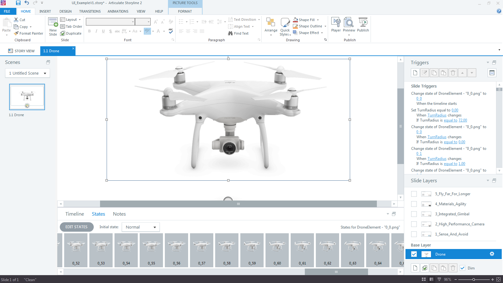
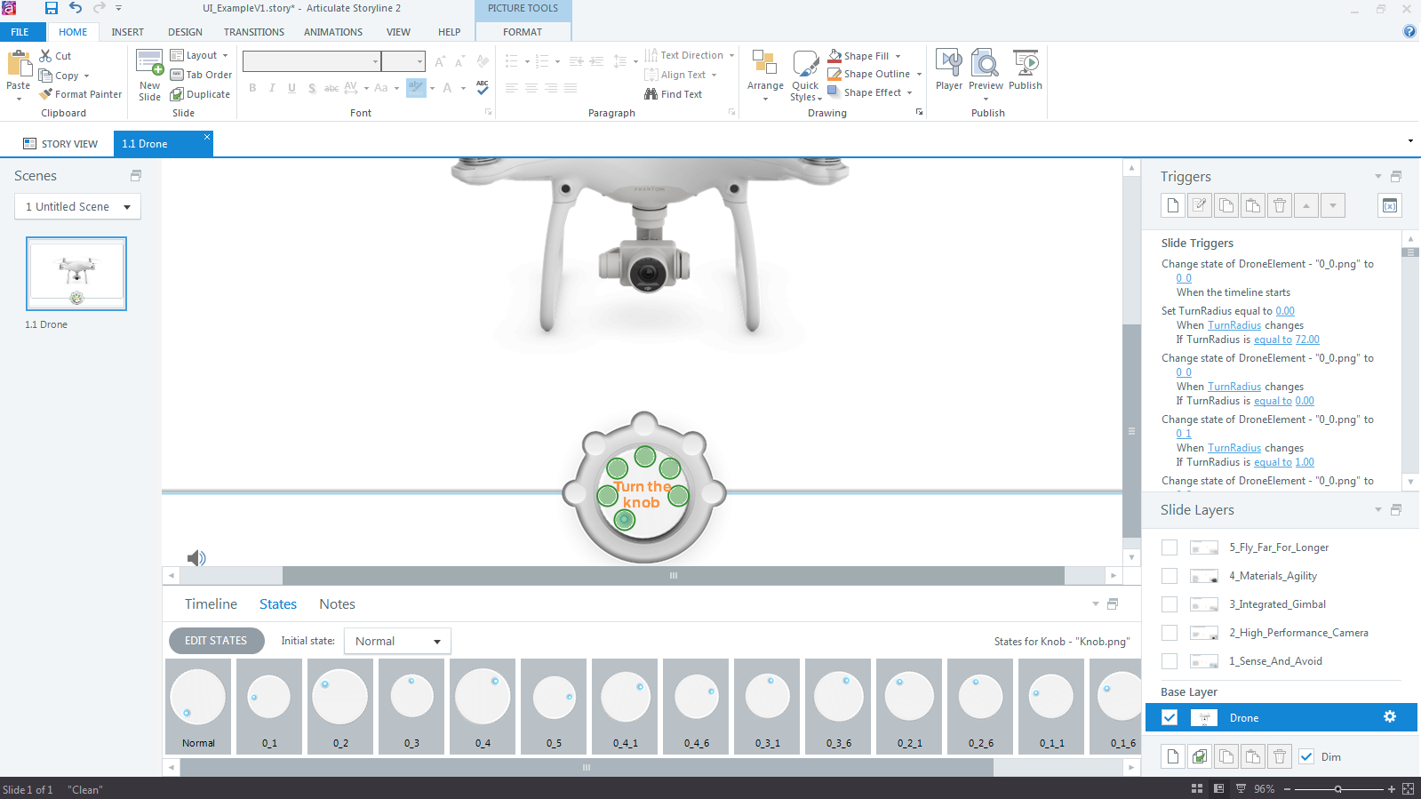
Edit 06/2018: This post here is somewhat related to the topic of software simulations. I used the UI of DroneBlocks for a drag-and-drop interaction.

