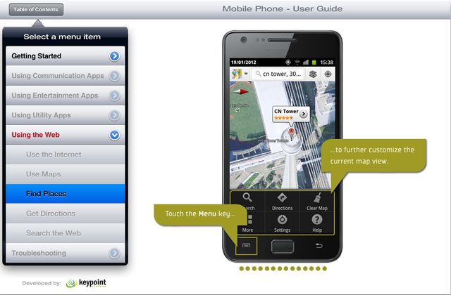
I saw a screen cast recently from the folks at Articulate that shows how to make a Storyline tutorial look more like an iPad app. I didn’t much care for the particular wood texture and icons they used for the nav bar, but it reminded me of a Captivate sample that I had done in January 2012 (I guess I was ahead of my time!). Back then Adobe had a contest on Facebook, for the best Captivate tutorial in HTML5. I actually ended up winning one of three prices (an iPad). For my entry, I had built a ‘Mobile Phone User Guide’ that was styled to look like an iPad app, complete with a pop-over menu, iPad-style header bar, etc.
Here is what this ‘app’ looked like:

Since then, I have found a lot of great resources for design ideas and free graphics that I often use to spruce up my Captivate files.
Here is a list of my favourite sites:
- Premium Pixels for great (downloadable) Photoshop files
- UI Parade for inspiration and amazing designs of buttons, menus, slider elements, etc.
- Teehan+Lax for stunning pixel-accurate Photoshop files of iPad, iPhone, and Android interface elements.
- Articulate Community for great ideas on how to use nice graphics and navigation elements in eLearning
- Glyphish for great iPad/iPhone icon sets
- PSDBucket for a daily dose of design inspiration
- PSDBlast for nice free icons, buttons and misc. bits and pieces
With these awesome resources available, there is no excuse anymore to stick with the boring, tired Captivate playerbars, preloaders and corny stock photos! I’m sure there are a lot more of these sites, if you know of any, I’d be happy to add them to the list.

Another very inspiring list of resources that I never knew existed.
Many thanks for this.