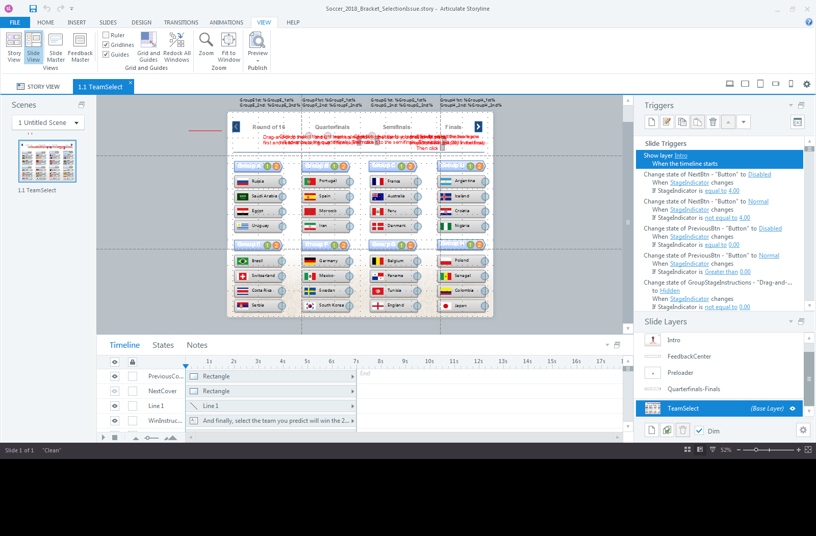
With this year’s Soccer World Cup not that far away, I thought I revisit an interaction I had done for a recent Articulate eLearning Challenge. The idea was to create one long, horizontal interaction to fill out the complete world cup tournament bracket (similar to this one here), starting with the Group Stage, all the way to the Final. Users would navigate back and forth between the various segments of the bracket, all in a single slide. That sounded like a good idea until I started building the first segment: the Group Stage, that requires users to select two teams from each of the eight groups.

I wanted this stage to be a drag-and-drop interaction. The problem is that d&ds cannot be part of a group and that’s what was required to horizontally move the entire bracket. I ended up creating a custom drag-and-drop interaction. I couldn’t use a standard Storyline d&d interaction, because each of the drag objects can have several drop targets.
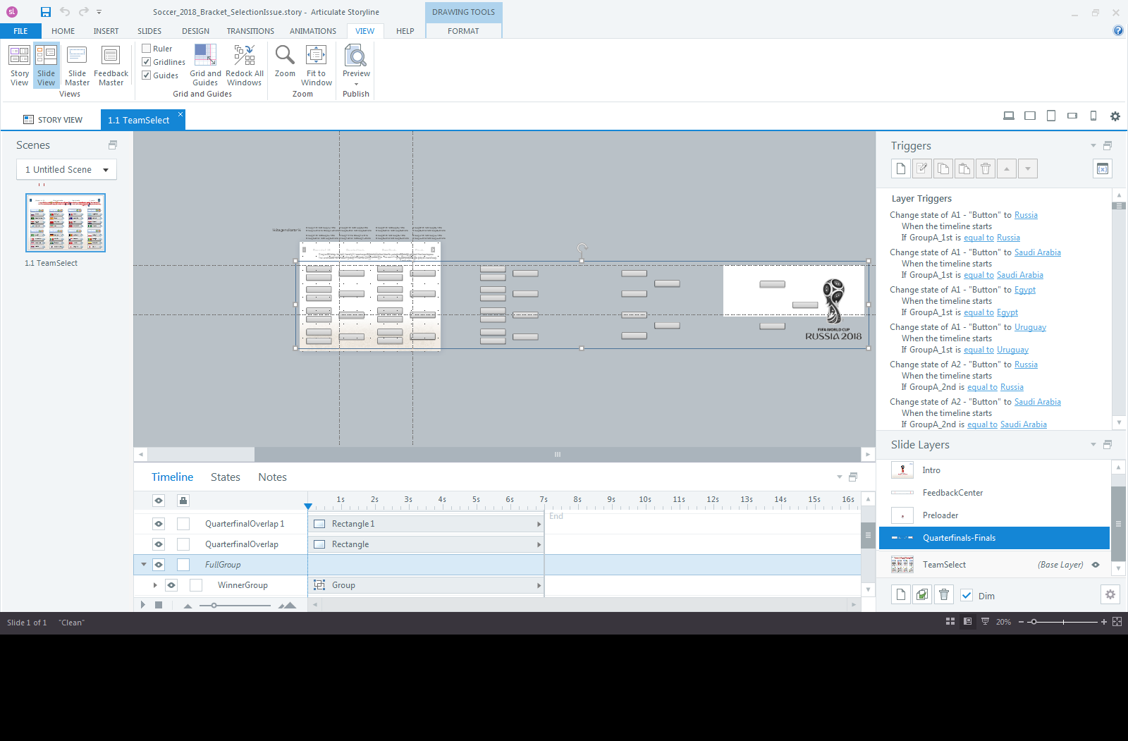
All other stages (from quarterfinal selections, to the final) were done as one group on a layer.
Combing all the elements into one group allowed me to apply motion path animations to it. BUT, this group then becomes one large clickable object, which doesn’t respect built-in Selected states of group objects anymore. And with 32 teams in the Group Stage, the number of possible pairings in each stage seamed daunting at first. Also, a user can at any time go back to a previous stage, change their selection and then go forward again. The grouped interaction has so many buttons and states that it takes a few seconds to load. I added a ‘loading’ screen to give a visual queue that something is going on in the background. A few hundred triggers later I got a reasonably stable prototype to work.
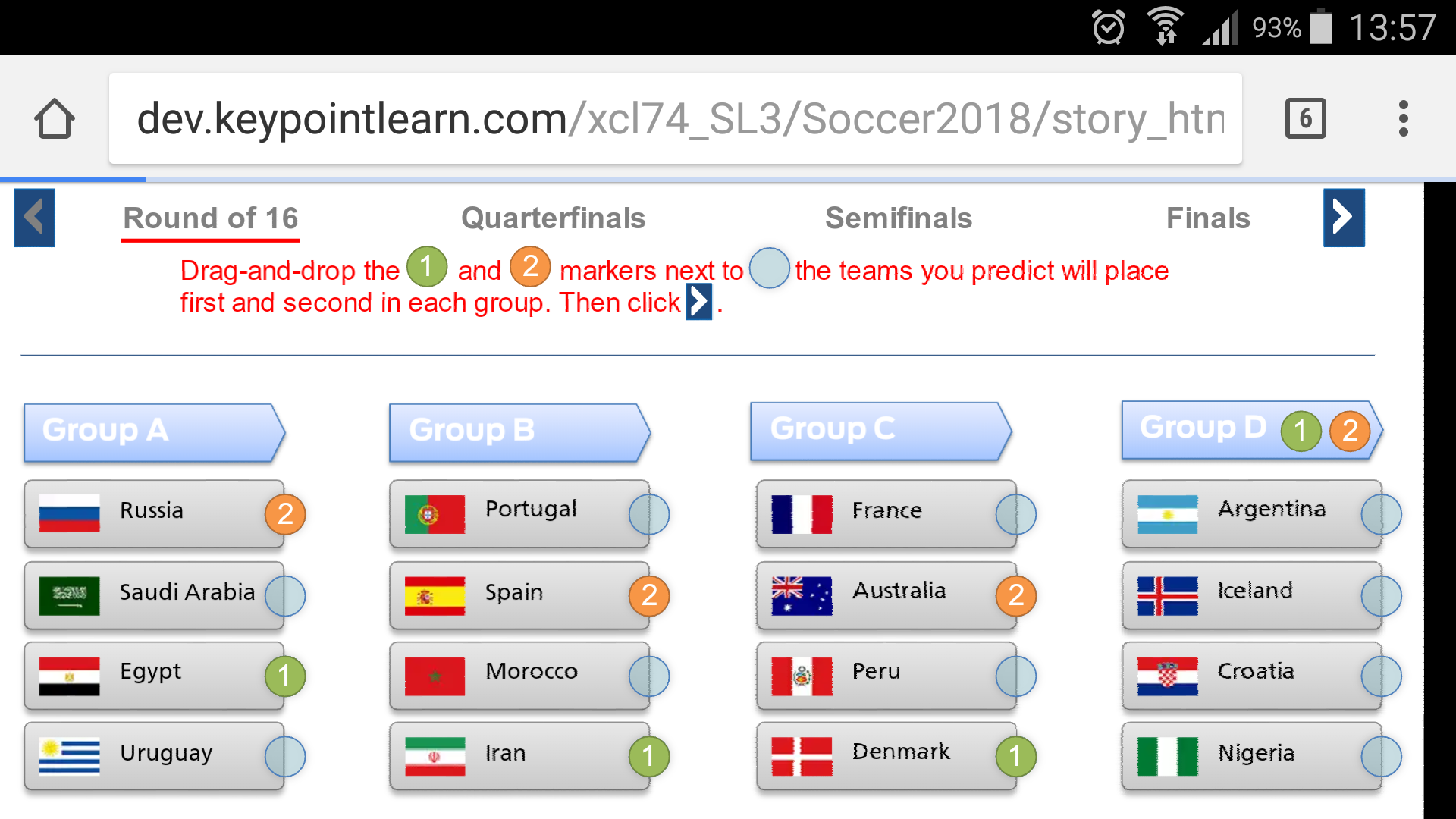
Although cumbersome to use on a small screen, this interaction even works on my mobile device.
In hindsight, it would have been easier to create each stage on a separate layer (or slide) and forget about the seamless horizontal navigation idea. Some possible ways to enhance this interaction could be to store and display the selections in a GoogleSheet, use a slider to navigate or allow users to print their selections.
I tried to create the same interaction in Adobe Captivate 2017. I didn’t even get past the first d&d screen. It turns out that Captivate has a limit for the number of buttons on one slide and my layout far exceeded that number. Here is the thread in the Adobe eLearning community.
Never mind the soccer theme. This type of interaction may be useful to present step-by-step processes, flow diagrams, decision paths, etc.
Edit 04/30/2018: I just happened to see this web-based bracket challenge here, I guess the folks at FIFA had the same idea.
Edit 05/2018: I created a simplified version in Adobe Captivate 2017, now that the limitation I ran into earlier was fixed with the latest CP update, see here.
Edit 06/28/2018: Now that the group stage is complete, I updated the interaction with the teams that advance to the next stage.


Well done, Michael! I like your layout better than FIFA’s.
Thanks Jane!