The weekly eLearning challenge #115 was about using Storyline sliders to create Parallax Effects. You may have seen this effect on modern websites where content is scrolled at slightly different rates. It just so happened that I had seen a cool website recently which used that effect. I was curious to find out if the basic layout and function of this website could be recreated with Storyline sliders, layers and triggers.
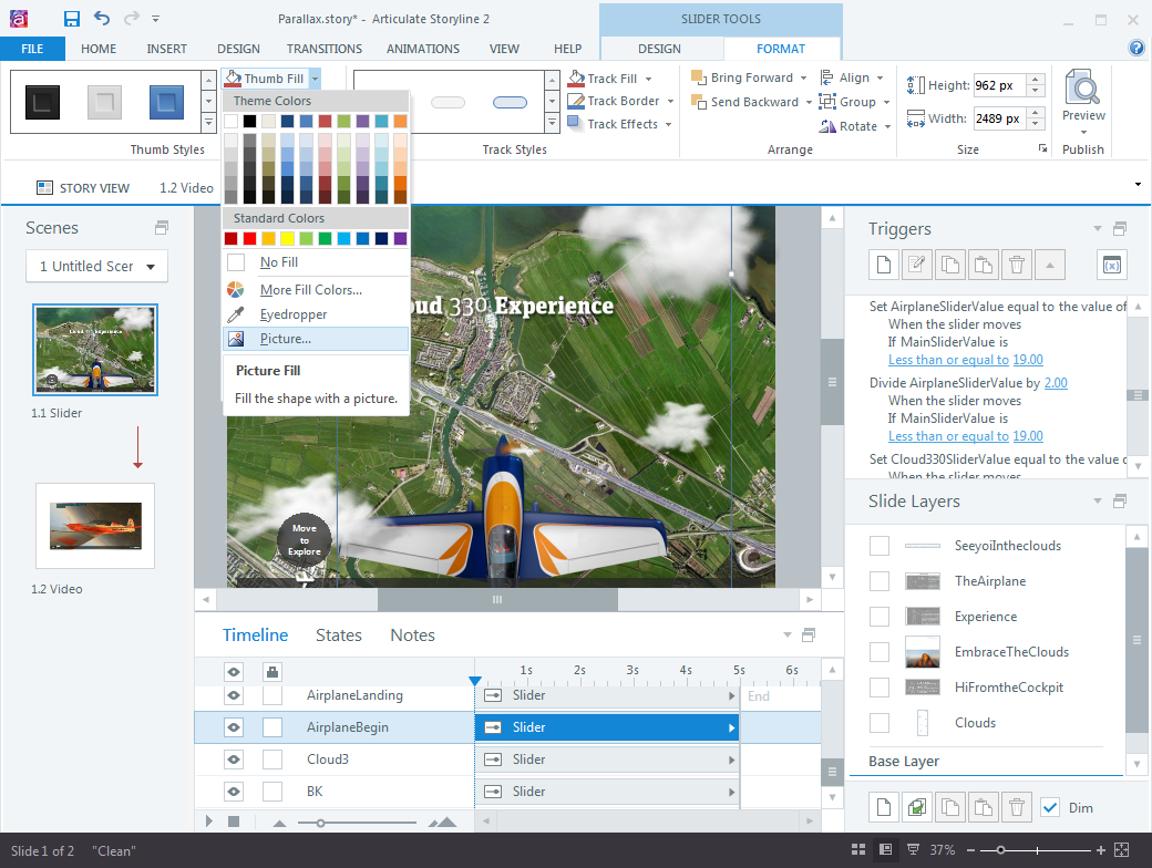
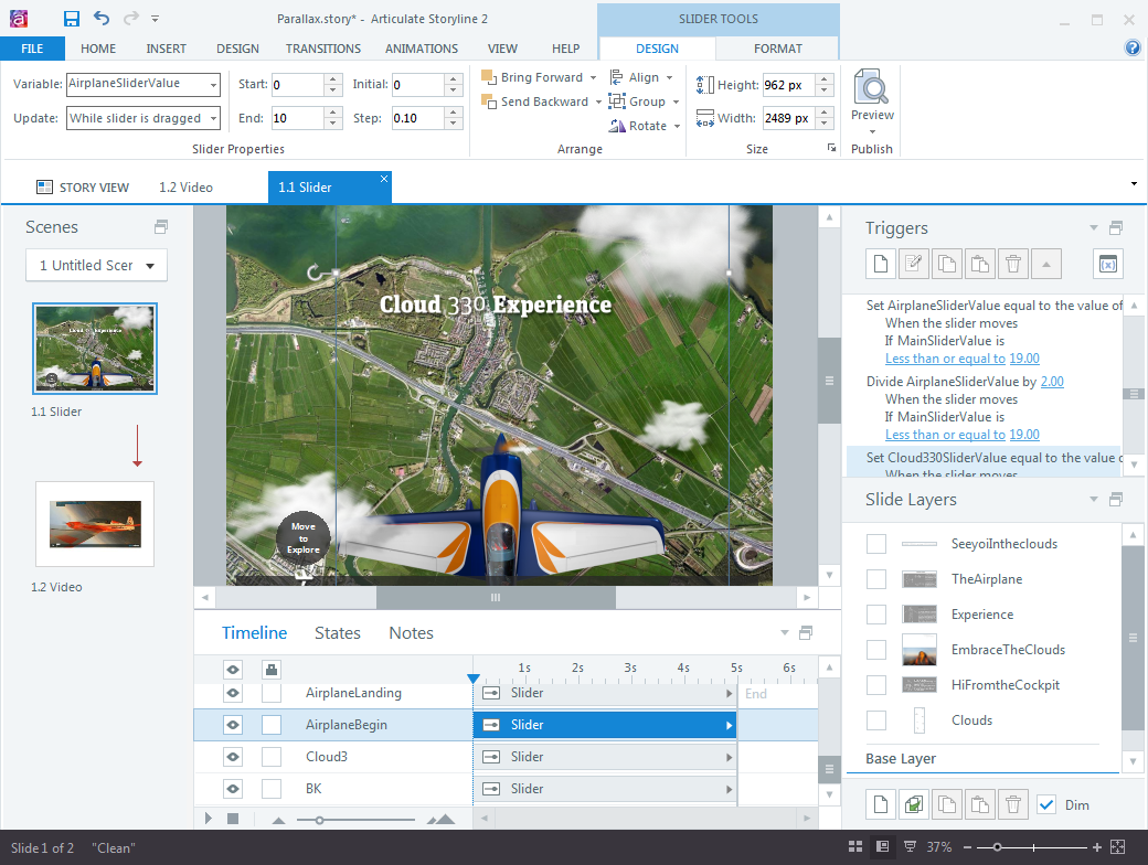
The Storyline setup was quite simple. Each element, e.g. clouds, airplane, aerial view background were all created as sliders with no track, and an image for the thumb fill.

At various points along the slider path, some content elements are displayed. I opted to use layers for these elements. The transitions in my example file are a bit rough, but it was ‘good enough’ to verify the concept.
The slider at the bottom of the screen ‘drives’ all the other elements. With a bit of math and triggers, I made the various sliders move at slightly different rates. For example, the plane moves much faster than the clouds; the clouds move slightly faster than the background landscape, etc. The layering of the various sliders also adds some depth, e.g. some of the clouds overlaps the airplane`s wings while others are moving below the plane. Also, the shadows of the clouds add some perspective and the illusion of distance between elements.

The whole interaction was done in one slide, except for the lightboxed video. That’s about it, there was nothing in the Storyline logic that I hadn’t done before, but it was nice to confirm yet another application for sliders.
See here for the finished Storyline example. Just for the heck of it, I also did a self-running, looping version, see this version here. The movement is a bit jerky, but it does work and only required a few additional triggers. Set this version to fullscreen, remve the player frame and you have yourself a neat kiosk-style presentation.
Not too shabby, considering I hacked both versions together in an afternoon!
