I was looking for flight simulator information the other day and happened to see a great image showing the cockpit of an Airbus 350. The image was huge, 5617*3744 pixels. That made me wonder how an image of that size could be presented in a Storyline project, without loosing detail. My first thought was to use a Zoom region, but that would not allow to manually zoom in on a specific region of the picture. So, I wanted to see if I could find an easy way to both zoom AND pan a large picture.
It didn’t take very long to come up with one possible solution:
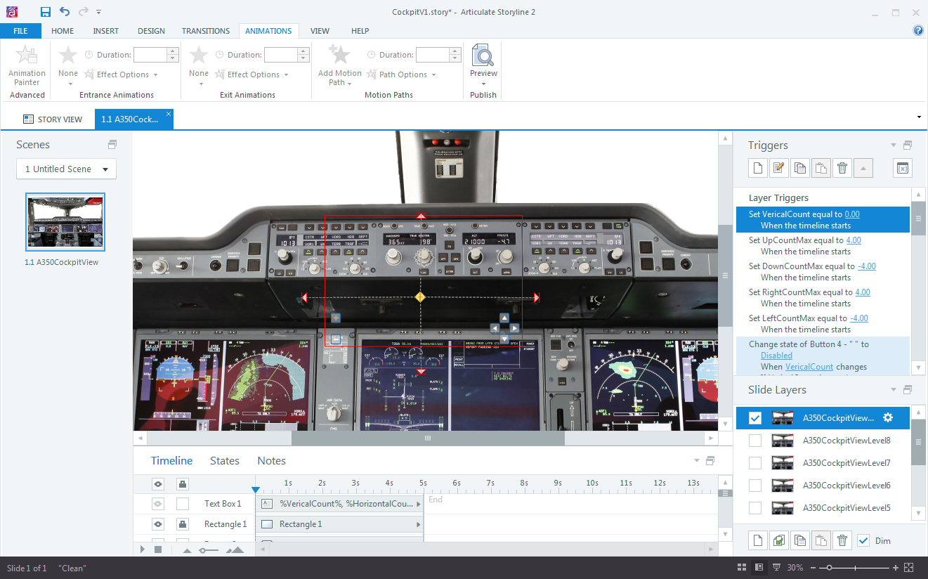
First, I had to tile the image into smaller segments (Storyline can handle images up to 2047*2047) and then size them correctly to create different zoom levels that show more and more detail. While each zoom level is on its own layer, they all re-use the same image tiles which cuts down on the file size. The entire interaction is contained in a single slide. The only challenge here was to figure out the dimensions and positions of the image tiles on each layer…nothing that couldn’t be handled with a bit of math!
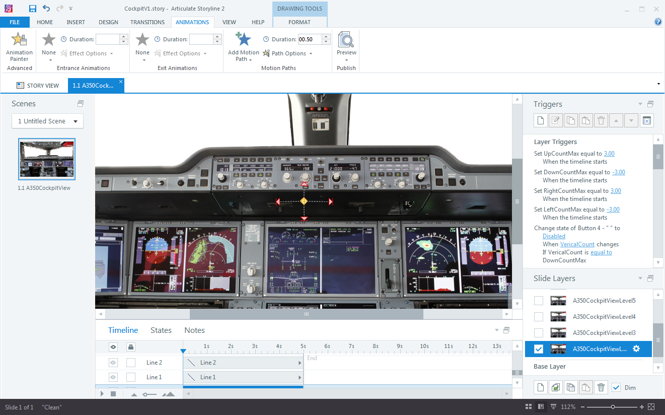
For the Panning effect, I added motion path animations for the horizontal and vertical panning.

These animations are triggered by clicking simple navigation buttons. Variables and additional triggers with conditions are used to enable/disable the buttons once the panning reaches the edges of the image.

This type of zoom and/or panning could be used in Storyline projects to view large maps, detailed pictures, complex schematics, org charts and much more.
Here is a test file I built with 8 zoom steps, from an overall view of the cockpit all the way up to a very detailed view of every switch, knob and dial. Note that the zooming doesn’t impact the image quality at all. The panning effect is only enabled on the lowest and highest zoom level. The panning steps on the lowest zoom level are fairly small, while at the top level (showing the fullsize image), each panning step moves the image a significant distance.
I could have spend more time to finetune the positions and dimensions of the motion paths to make them completely symmetrical, but who has the time 🙂

Hi, got a little hiccup in my horizontal scrolling, the image always nudge a pixel up/down when changing direction, do you have any idea why? i’m doing a same pan and zoom slide here. any feedback are much appreciated
I guess you are using two motion path animations (to-left and to-right). In that case, I’d guess that the two paths don’t have the same vertical position.
I used your Ctrl+Shift+Enter to determine both position (read it from the Articulate Heroes forum by you*thx)) and they are starting exactly from the same point (vertical position are the same). I even redid the Animation path again. The Image size is 1900x1080px and its aligned center/middle from the Canvas (950×640). Well it is a 1 pixel nudge quiet annoying when you notice.
Later on I found out when the image Vertical position is (-) it start to nudge. When the V value is positive everything is smooth although the Horizontal is negative.
Tried using shapes with images in states or just shapes its almost the same. Guess maybe its a AS limitation.
But again need more testing, thank you for responding. And thank you for sharing your projects , they have been a lot help for me learning Articulate from basic.
Hi – I followed a post I found on e-learning heroes and came to this blow.
I’m having real difficulty recreating the above and was wondering if you had more explicit instructions, or a sample of the story file that you’re willing to share?