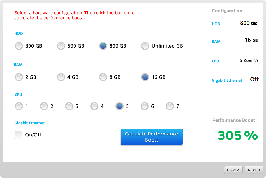
I was recently asked to review a Storyline project that had been developed for pre-sales/customer support training of computer technicians. The purpose of the tutorial was to introduce technicians to various hardware and software configuration options for high-end desktop workstations. I looked through the project, made some notes about minor inconsistencies and a came up with ideas for improving the look&feel of the content. Here is an example of the ‘before-and-after’ of one screen I can share:

This interaction was part of a scenario where technicians needed to think about the (imaginary) customer’s requirements and then select various hardware options to ‘build’ a configuration that would meet them. This interaction had been built with check boxes, button sets and triggers to calculate the expected performance boost, based on the selections. As Jerry Seinfeld would say “Not that there is anything wrong with that, BUT…” I thought this interaction could be improved with a more technical look&feel.
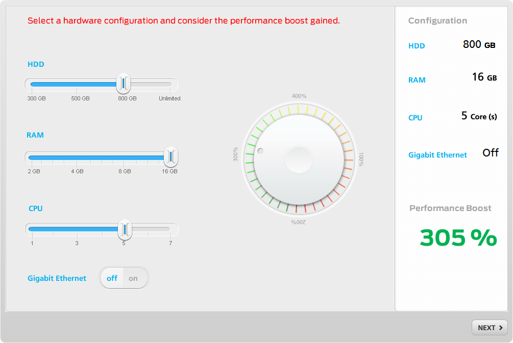
Here is what I came up with:

By using sliders, technicians can see immediately how changing the configuration options impact performance. There is no button to click to calculate the performance boost value after a new selection; the value changes as the sliders are dragged. I also added a visual performance indicator which also changes in real-time.
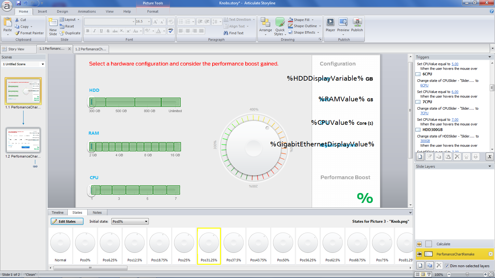
Creating a slider in Storyline is quite simple and there are several example source files available in the Articulate E-learning Heroes community. I explored two options for creating a slider. First, I attempted to use hotspots to change the state of the slider element. That worked okay, but had a couple of drawbacks; Moving the mouse over a hotspot with hover triggers doesn’t show the hand cursor and a real slider activates when the mouse button is down (not simply by hovering the mouse). So, I ended up using transparent drag and drop objects that make the slider realistic.
The only other addition to the layout was a visual performance indicator which I built with custom states that are displayed, based on the calculated performance value.

There you have it, with a bit of work a standard Storyline interaction was turned into a fun activity that created a welcome break in an otherwise rather dry tutorial. Here is one version for the interaction to try.

What a great idea-Thanks for sharing!
Awesome!!
Hi, do you have the source file available to view for this? It would be great to see how it works ‘under the hood’ as this is the best slider example i’ve come across.
Hi Michael, thanks for posting all of this, it’s amazing how you could work around not having a specific slider function like in Storyline 2 and still mimic the same function!
I also didn’t find anything else as good as your slider example and would love to know more about it, maybe through a tutorial or seeing a basic example in the working file (i.e. ‘under the hood’). as I couldn’t make too much out of the screenshots shown here:
http://blog.keypointlearn.com/2014/03/27/examples-of-slider-interactions-in-storyline-take-ii/
Thanks for having shared your work!
David
There is some more info on pre-Storyline 2 sliders available here: http://www.screenr.com/Sjw7